iStream Design System 2.0
A fragmented design system rebuilt from the ground up — unified across 3 platforms.

Role
Design Lead
Industry
OTT
Project Type
Design System
Duration
5 months
TL:DR
iStream's design system had become a liability — fragmented across 3 platforms, with no token structure, inconsistent icons, and no shared rules. As Design Lead, I led a team of 6 designers and collaborated cross-functionally with engineers, testers, technical content writers, and managers to audit, rebuild, and ship the system in parallel with active product sprints — without halting a single feature delivery. The result: 30% faster feature delivery, full cross-functional adoption through incremental releases and code snippets, and a scalable foundation ready for sports integration and ad monetization.
Project Background
The International Broadcasting Convention brought new client commitments and an expanded product scope — sports integration, ad monetization, new verticals. But before any of that could be built, the foundation needed fixing.
Design System 2.0 wasn't a housekeeping task. It was the critical path. Sports content, admin upgrades, and Ad Suite integration — three major product expansions — were all waiting behind it. Until the system was right, nothing else could move.

My Responsibility
I led the design team through the end-to-end workflow—from auditing fragmented components to designing a scalable, reusable system, while collaborating closely with engineers and project leads to drive alignment across the product.
Designers
Developers
Stakeholders
Base components and variants
The Approach
With active client commitments post-IBC, conventional approach wasn't an option. Instead the team built predictively — standardising components needed in the next sprint first. If a sprint needed something not yet standardised, it was designed in parallel and added to the system as part of that sprint's delivery. Nothing waited. Nothing blocked.

Findings
The audit exposed inconsistencies that had quietly accumulated across the product over time. Components looked similar on the surface, but behaved differently underneath.

Colors
Multiple shades and duplicate color values without shared token rules.

Fonts
Inconsistent font sizes, weights, and hierarchy across platforms.

Icon Packs
Icons from different packs with inconsistent strokes and proportions.
Key Decision
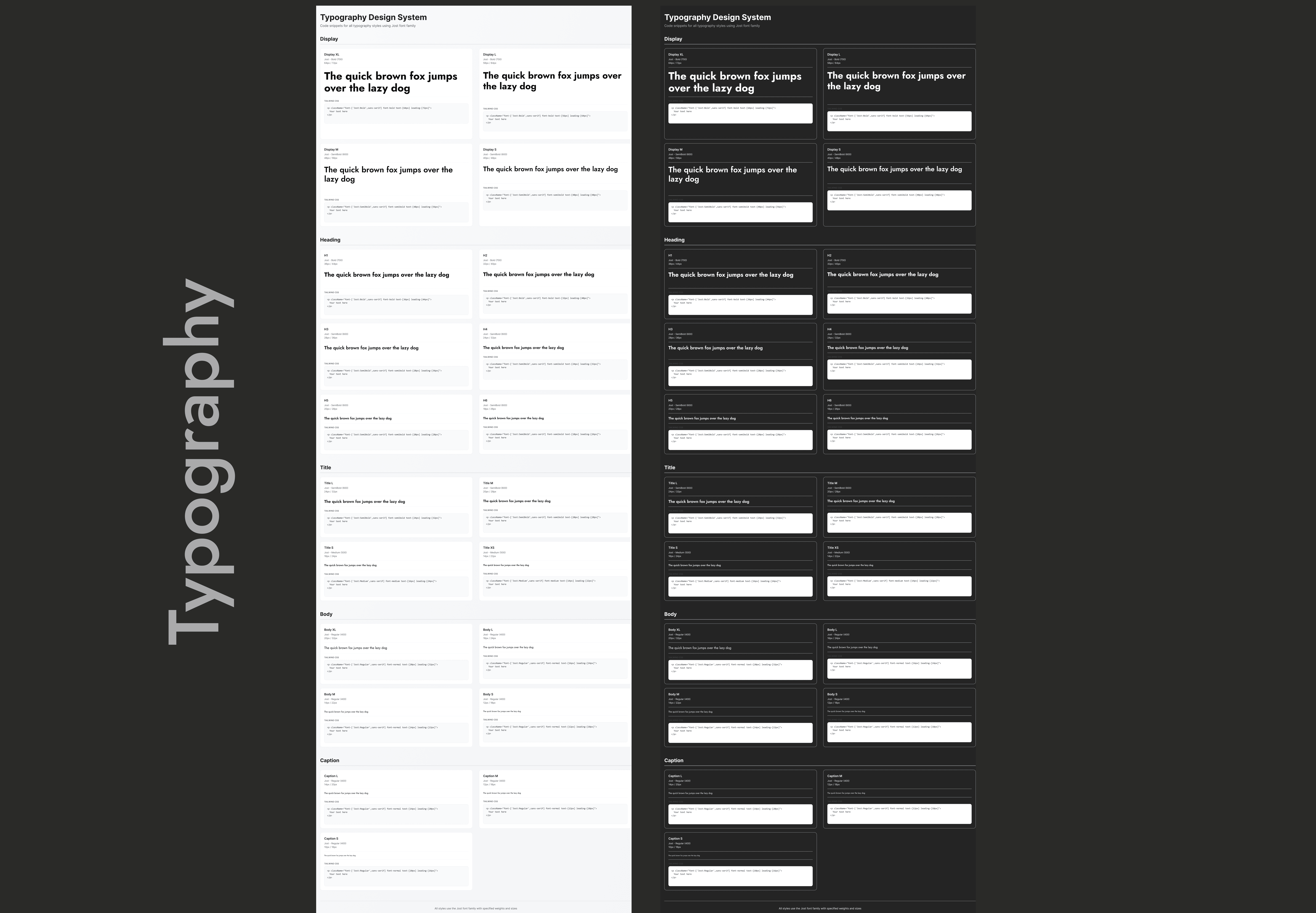
The first and most important structural decision: define everything as tokens before touching components. Color values, type scales, spacing units, elevation levels — defined once, referenced everywhere. A change to a token propagates across all 3 platforms instantly.
The
Design
System



Outcome
The design system was adopted across 6 product teams — Android and iOS mobile, Android TV, Apple TV, Roku, and the responsive web platform — becoming the single source of truth across every surface iStream ships on.
Beyond the system itself, I led cross-functional adoption through incremental release sessions with engineers, testers, and technical content writers. Each release included live component previews and ready-to-use code snippets built to align with the team's React JS stack — reducing implementation friction and eliminating guesswork at handoff.
The system documentation was integrated into the team's shared knowledge base, making it a living resource that new designers and developers could onboard from independently.
Teams Adopted
Time to design new screen
Design dev handoff time
Dev time

Learnings & Takeaways
Audits uncover hidden inconsistencies
A thorough UI audit revealed cross-platform gaps, proving systematic evaluation is the first step to building strong foundations.
Design tokens are the backbone of scalability
Standardizing tokens for color, typography, and spacing ensured consistency and made scaling across platforms effortless.Documentation drives adoption
Clear usage guidelines and contribution rules empowered both designers and developers to confidently use the system.Collaboration is key to success
Partnering with engineers, interaction designers, and a visual lead showed that a design system is a truly cross-functional effort.